Currys 2018
Summer
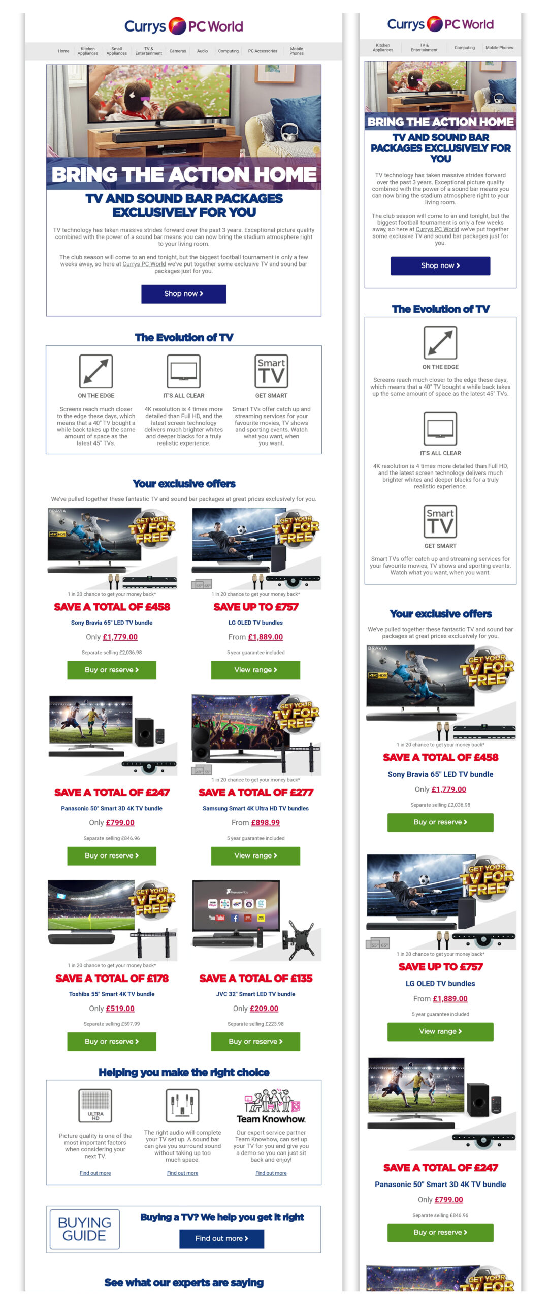
Summer in Currys 2018 revolves around enhancing the football experience to an extraordinary level, accompanied by an enticing promotion that offers a complimentary TV. The year 2018 witnessed the brand’s colors taking center stage, incorporating lifestyle images and a transparent design approach to amplify the message. Headers are rendered in the Gotham font, resonating with Currys’ distinctive blue, while the sub-message adopts a refined gray tone.
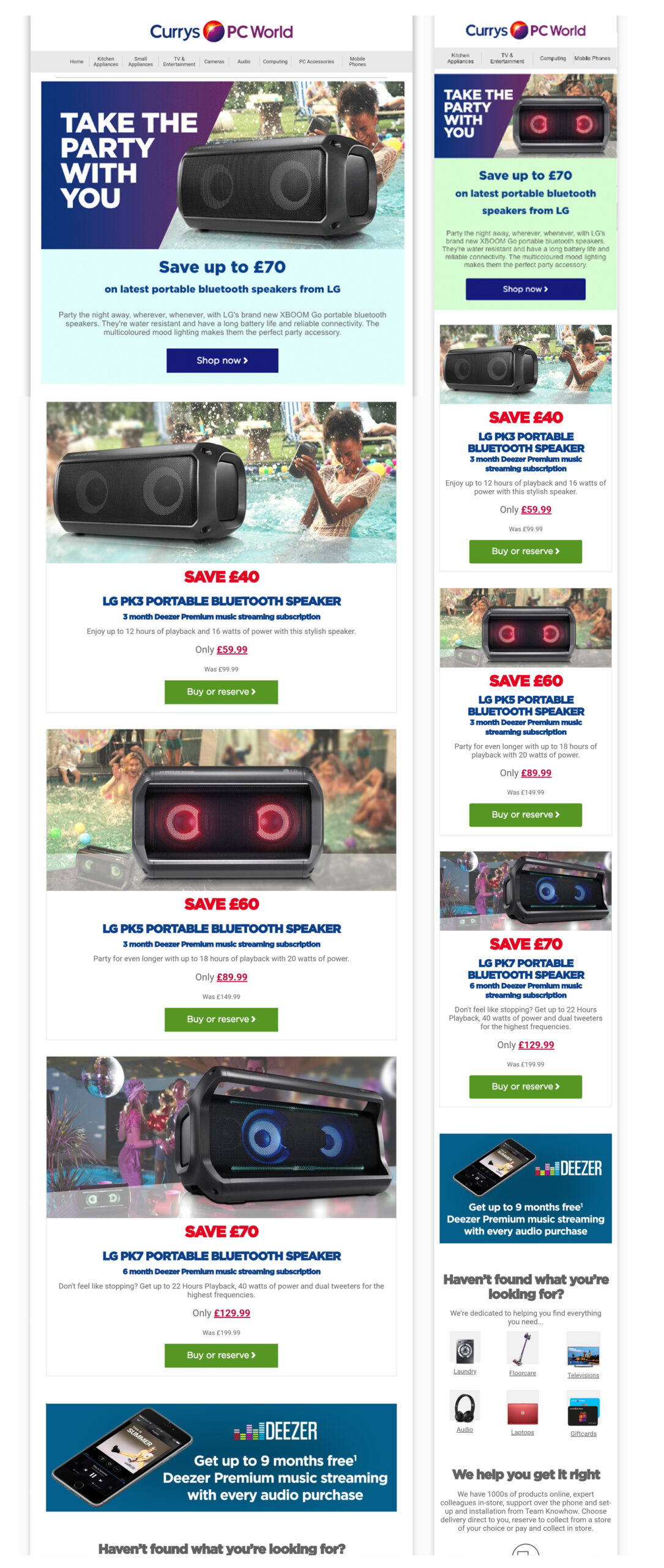
Audio funded campaign
This modest, self-funded campaign provided me with the chance to delve into design experimentation. I had the opportunity to craft animated images that showcase the product in diverse environments, as well as ingeniously place another animate background that changes colurs. It truly was an enjoyable and creatively fulfilling campaign!
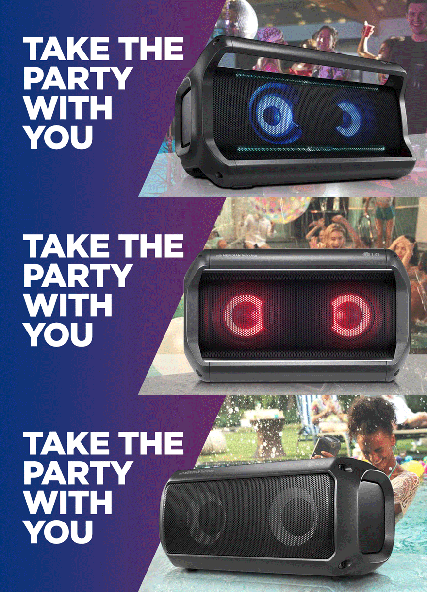
This is the animated hero banner.

This is the snippet of code that hold the animated background.
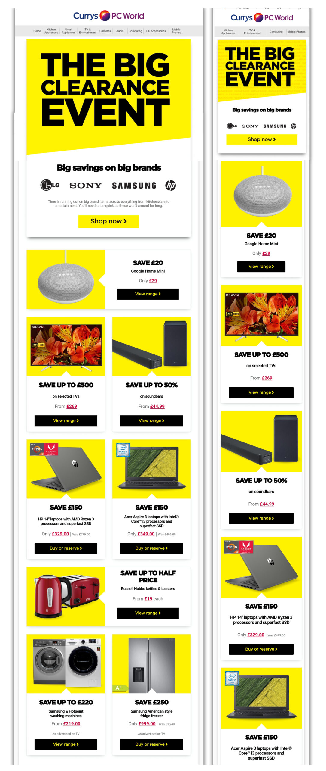
Clearance time
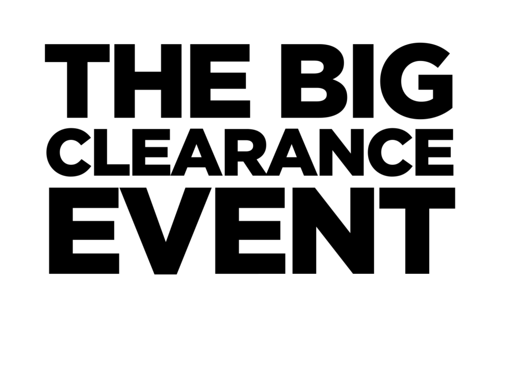
Currys PC World has always embraced the effectiveness of a compelling clearance campaign. Our approach centers on accentuating the core message (Black Gothan ultra) against a vibrant yellow backdrop. In this particular scenario, I chose to enhance the main banner by introducing a subtle animation to the yellow background, adding an extra layer of visual intrigue.
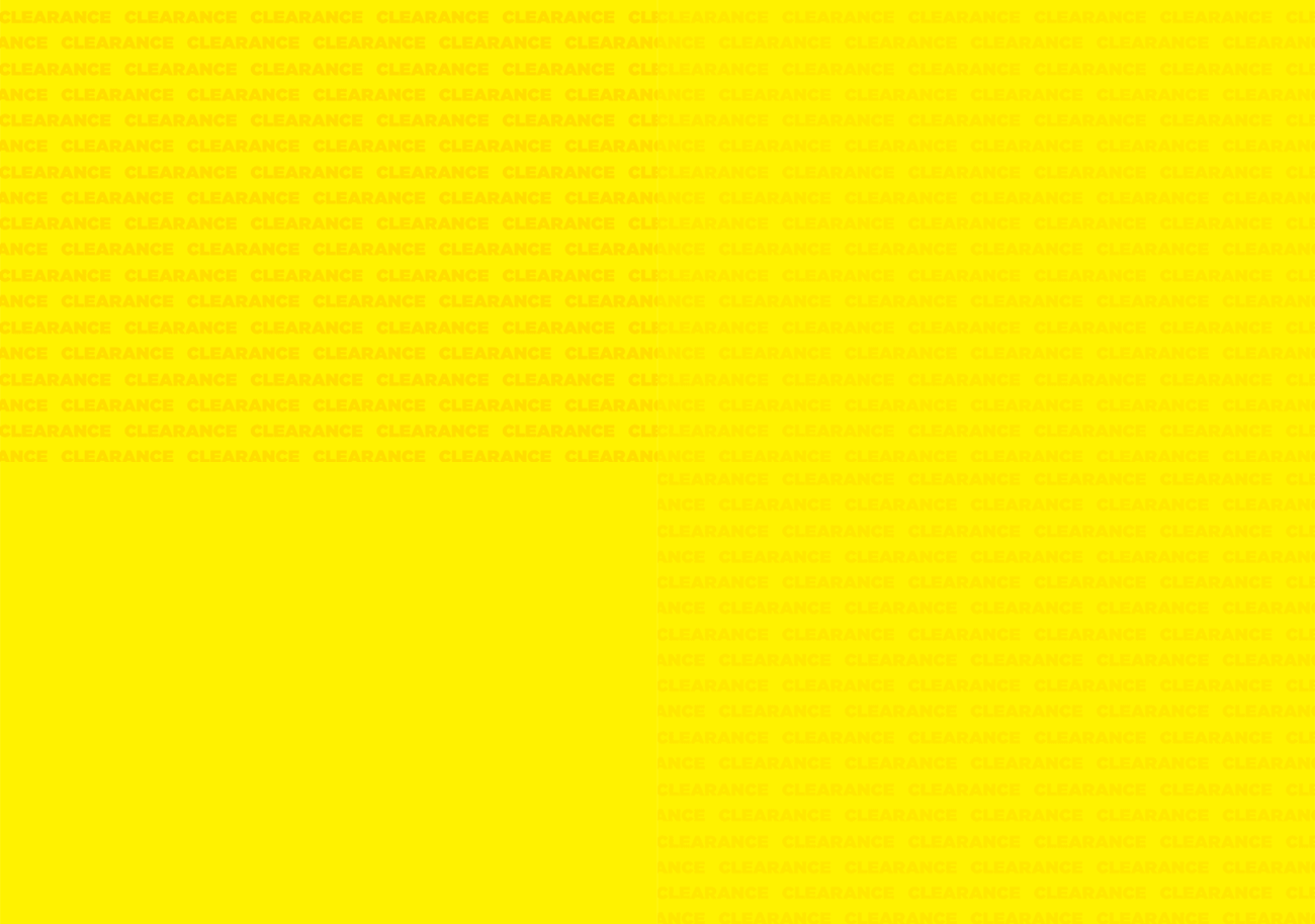
Here on top the background animation. At the bottom the png image that is sitting on top.
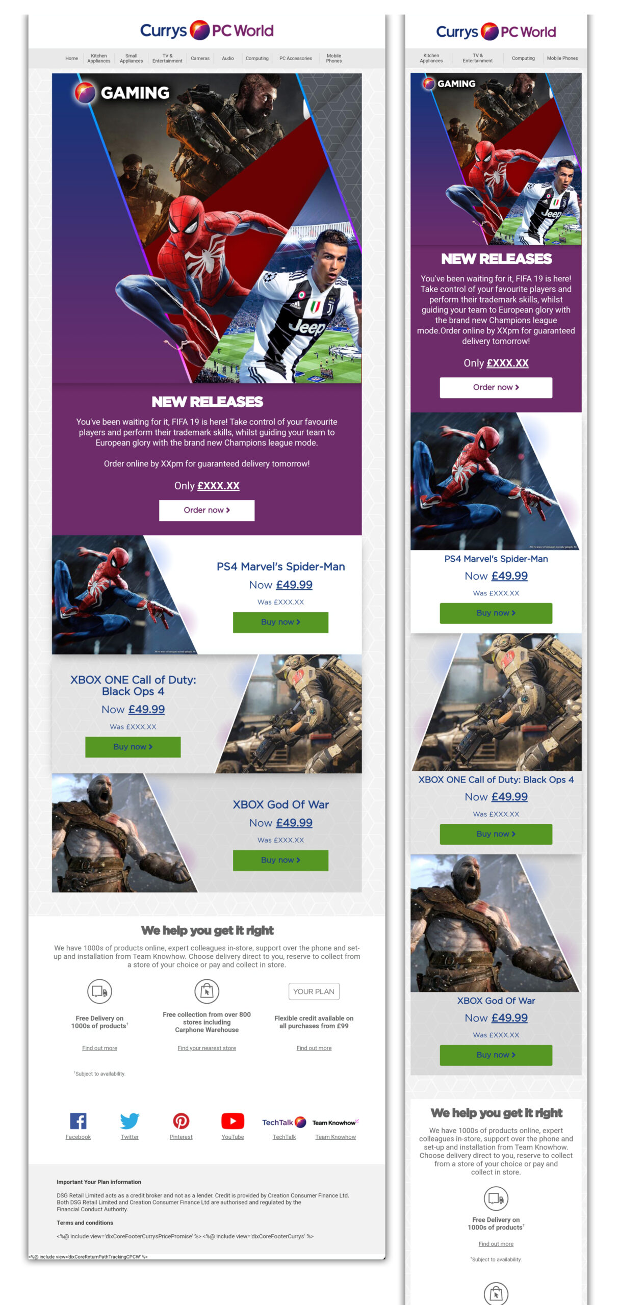
Gaming campaign
The gaming campaign offers a delightful opportunity to indulge in design creativity. This specific campaign was an absolute joy to work on. The way a patterned background envelops the entire email layout, with PNG images seamlessly overlaying and gracefully adapting for mobile devices, is a design element thant I truly enjoy building.
