Currys 2019
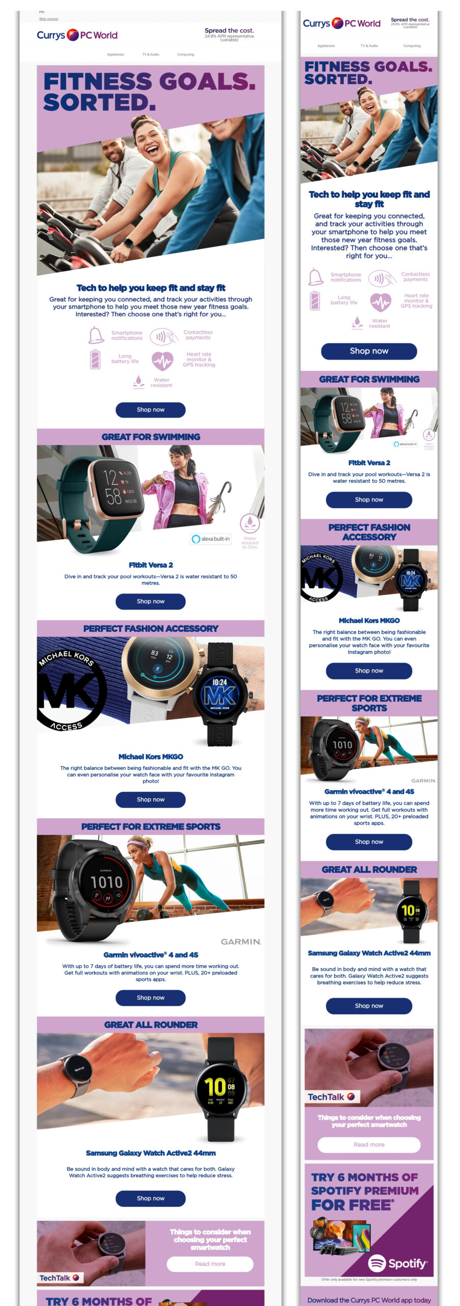
The fitness campaign
In 2019, a distinctive design trend emerged across both digital and print media, characterized by a captivating ‘slant’ cut. Currys embraced this trend wholeheartedly, as exemplified by this particularly stunning campaign. It featured the dynamic slanted background, Currys’ signature colors (blue and purple) in the ultra bold 2 tones headers, with an additional touch of light purple. The single-column layout is always a success for both desktop and mobile devices, contributing to its undeniable success.


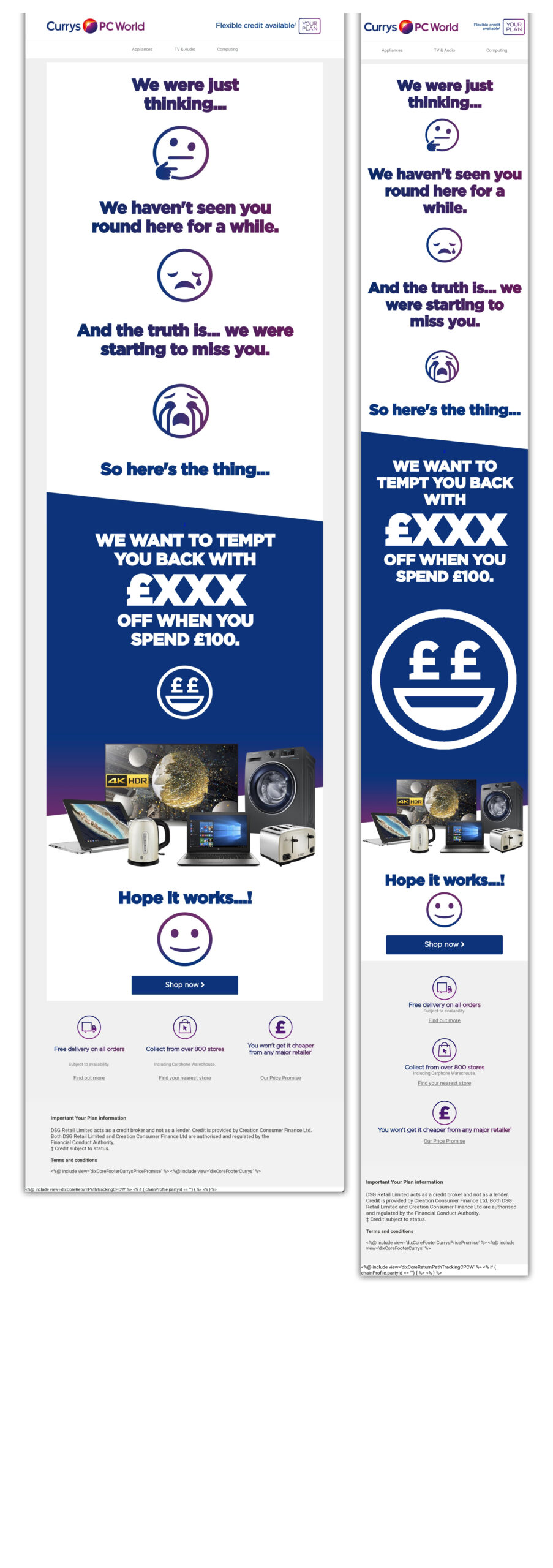
Forget Me Not campaign
The “Forget Me Not” campaign is an absolute delight! The use of dual-tone headers and the animated emojis add a touch of simplicity that’s incredibly effective.


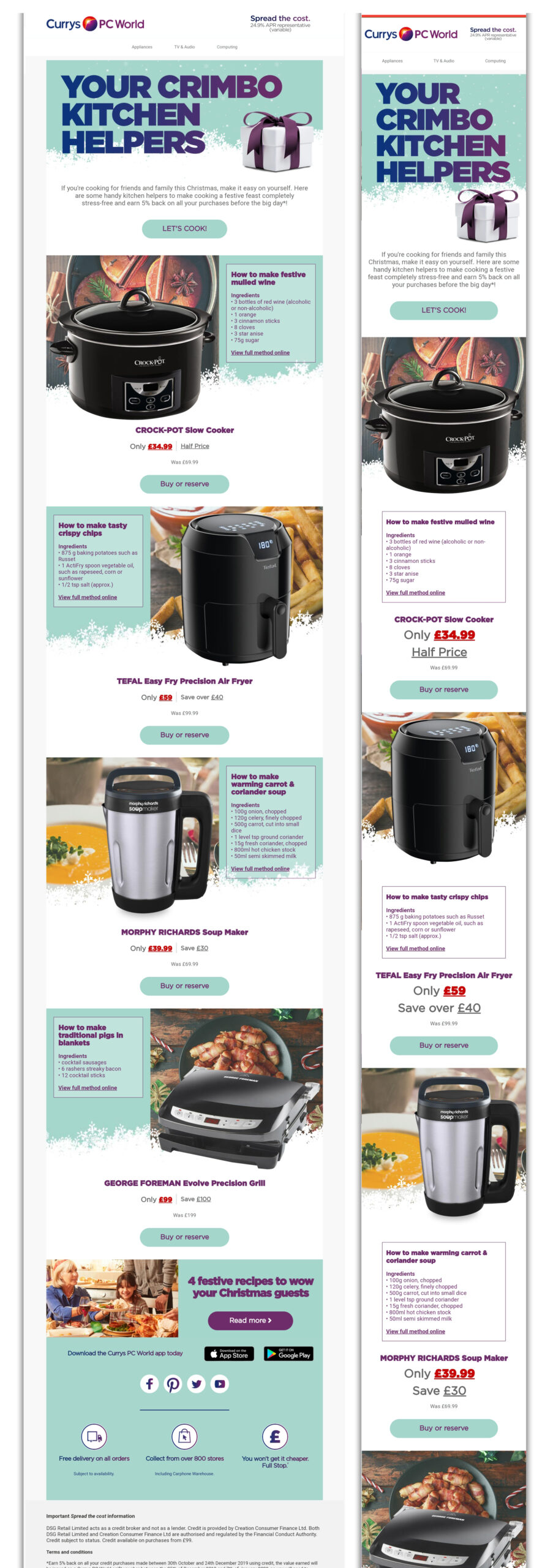
Clearance time
Christmas at Currys in 2019 had a more subdued design approach. We employed a gentle light green background and adorned it with subtle snowflake decorations. I specifically selected this campaign for its ingenious handling of background images that gracefully adapt and disappear when viewed on mobile devices.


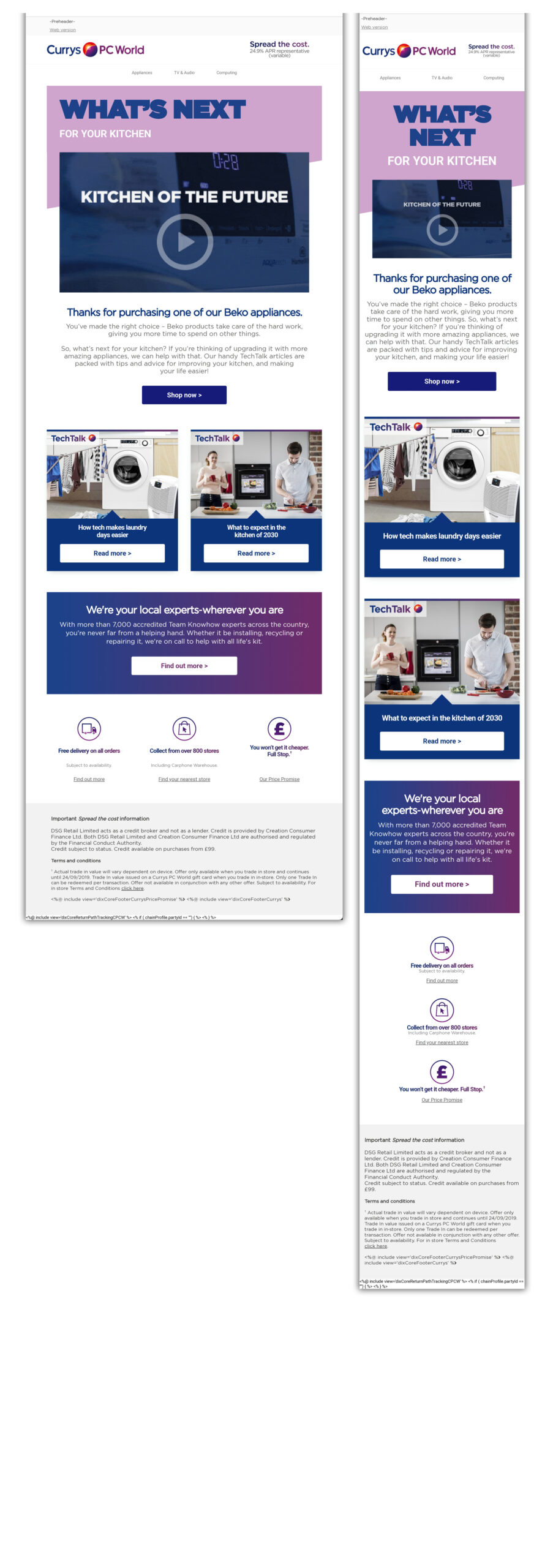
The embeded video campaign
This campaign truly pushed the envelope. I embedded a video within the email, ensuring there was also an animated fallback image for inboxes that don’t support videos. While I wouldn’t advocate making this a regular practice, it’s invigorating to explore something unique every now and then.
